


c'mon stk you can do better than that.
You really need to blend or have a overlay on the render it looks totaly plain. Be creative.
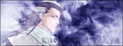
The x-men font is the only thing i like =] keep it up
4/10
.
big colossus sig
12 posts
• Page 1 of 1


![]() Wed Jun 07, 2006 5:00 pm
Wed Jun 07, 2006 5:00 pm
real good man, not really a bad sig....but you really need to try to work on your blending and your background more because its too sketchy and plain. And you also might want to try to switch the X Men font or atleast change its
background. Or you can also put the "Stk" text next to it.
5/10
background. Or you can also put the "Stk" text next to it.
5/10
![]() Wed Jun 07, 2006 10:46 pm
Wed Jun 07, 2006 10:46 pm
Keep in mind that trasparency doesn't work great for png and folks that use IE. I think if you save it as a gif, the XMEN title will stand out better with the transperency working for IE.
This is how I currently see it:

And this is how it should look:
[img]http://danceusapro.com/images/pspbrew/colossus2[1].gif[/img]
Just trying to help.
This is how I currently see it:
And this is how it should look:
[img]http://danceusapro.com/images/pspbrew/colossus2[1].gif[/img]
Just trying to help.
Stylin' with a "Phat" PSP CFW: 5.00 M33-6 w/Kernel 150 add-on 5.00


![]() Thu Jun 08, 2006 12:25 am
Thu Jun 08, 2006 12:25 am
Maikeru- wrote:YOUR A SUCKER COZ YOUR ON INTERNET EXPLOORER HAHA gif kills the quality of the sig.
Maybe you are right about IE. But I disagree a bit with Gif killing the quality. The only reason why this is true on my displays is I had to reformat a picture that was already a second generation, so my version was a third generation. But I bet if the original author saves it as a gif, it may look as good as his png version, since it will be a gif 1st generation. Am I correct?
I was also concerned that pspruler probably was seeing the same thing in his above feedback. Here is his quote:
pspruler wrote:And you also might want to try to switch the X Men font or atleast change its
background
I think he was seeing the same gray background as I with IE, but I am not sure.
Stylin' with a "Phat" PSP CFW: 5.00 M33-6 w/Kernel 150 add-on 5.00

![]() Fri Jun 09, 2006 2:45 am
Fri Jun 09, 2006 2:45 am
actually Jay-jay, gif does kill the quality of images. and i have it transparent u just gotta get firefox to see it! to see how gif kills the quality of the image take a look at the small space between the 'M' and the 'E' in the word x-men its kinda ridgy but gif makes it worse.
12 posts
• Page 1 of 1
Who is online
Users browsing this forum: No registered users and 28 guests